Creating a scalable design system
At RightShip, I led the creation and scaling of a cross-product design system built in Figma. It brought consistency, accessibility, and speed to our product suite, improving design efficiency by 20% and empowering teams with a shared source of truth.
Overview
Role: Lead Designer & Design System Manager
Duration: 2022–2025
Team: Design, Engineering, and Product
Tools: Figma, Jira, Miro, Notion & Zeroheight
Goal:
Create a scalable, maintainable design system to unify design across products, reduce inconsistencies, and improve cross-functional velocity.
The Challenge
RightShip’s product suite was growing rapidly and each team was designing in silos, resulting in:
Inconsistent UI patterns and interactions
Duplicate components and reinvented solutions
Slower development due to design ambiguity
A lack of documentation or shared standards
We needed a scalable system to unify design and enable faster, more consistent product delivery.
My Role
I owned the strategy, architecture, and rollout of the design system. My key responsibilities:
Audited existing design patterns and components
Architected the core library in Figma
Defined standards for color, typography, spacing, accessibility
Created documentation in Zeroheight
Facilitated adoption via training, documentation, and 1:1 support
Collaborated with engineers for naming, specs, and version control
The process
1. Discovery & Audit
I started by auditing multiple product surfaces, identifying common components, inconsistencies, and gaps.
Artifacts:
Screenshots of inconsistencies
Design debt tracker in Notion
UX pain point workshop with PMs & engineers
2. System Architecture
Defined foundational tokens and mapped out components to support both current and future product needs.
Key Deliverables:
Color & Typography tokens in Figma
Component hierarchy & variant naming conventions
Auto-layout and constraints for responsiveness
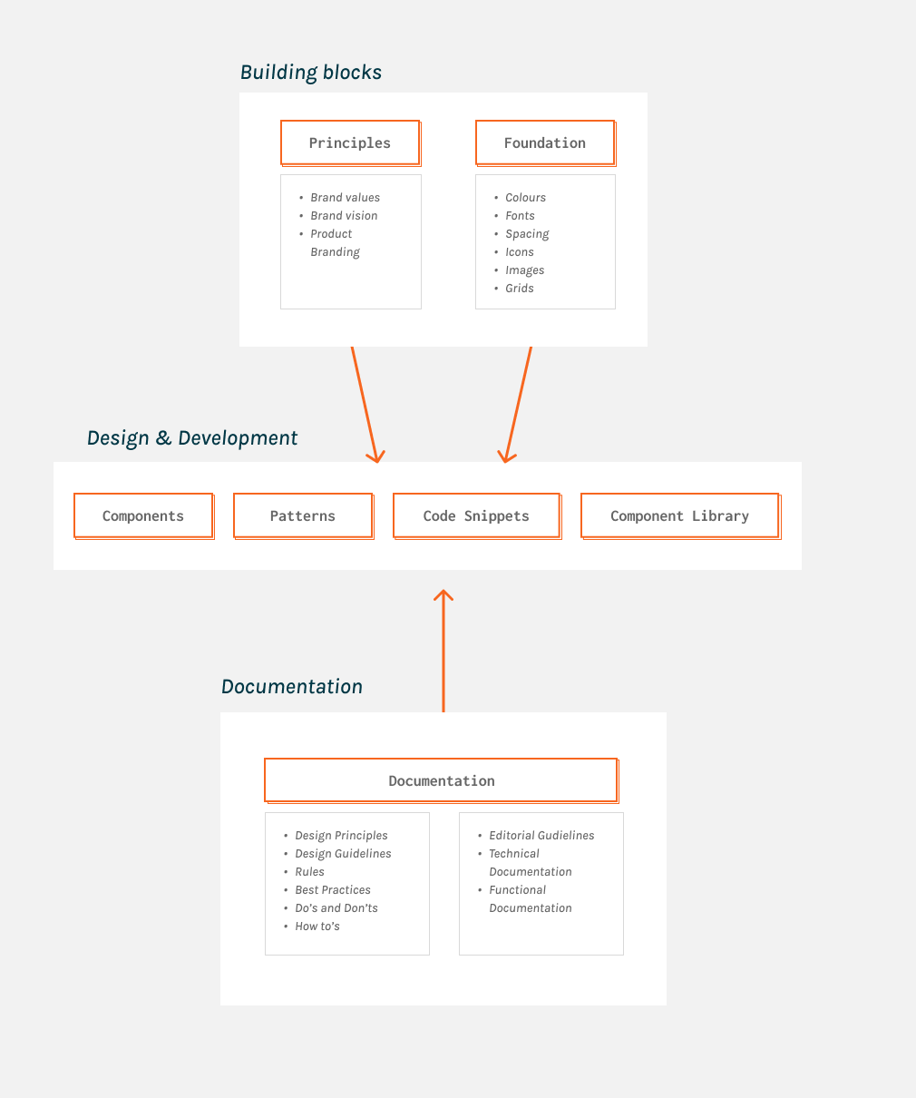
Figure 1 Design system structure
Created a master Figma file with shared libraries and components — buttons, forms, tables, modals, nav, tags, banners, and more.
Features:
Variants for states (hover, disabled, loading, etc.)
Component blueprints & nesting for scale
Grid systems and accessibility built in
Patterns
Templates
Component usage guidelines
Charts & data visualization guidelines
3. Figma Library Buildout
Documented usage, dos/don’ts, and component behavior in Figma (as Library) & Zeroheight.
Included:
Anatomy breakdowns
Component usage guidelines
Charts & data visualization guidelines
Accessibility requirements
Developer-ready specs
Live previews from Figma
4. Documentation & Guidelines
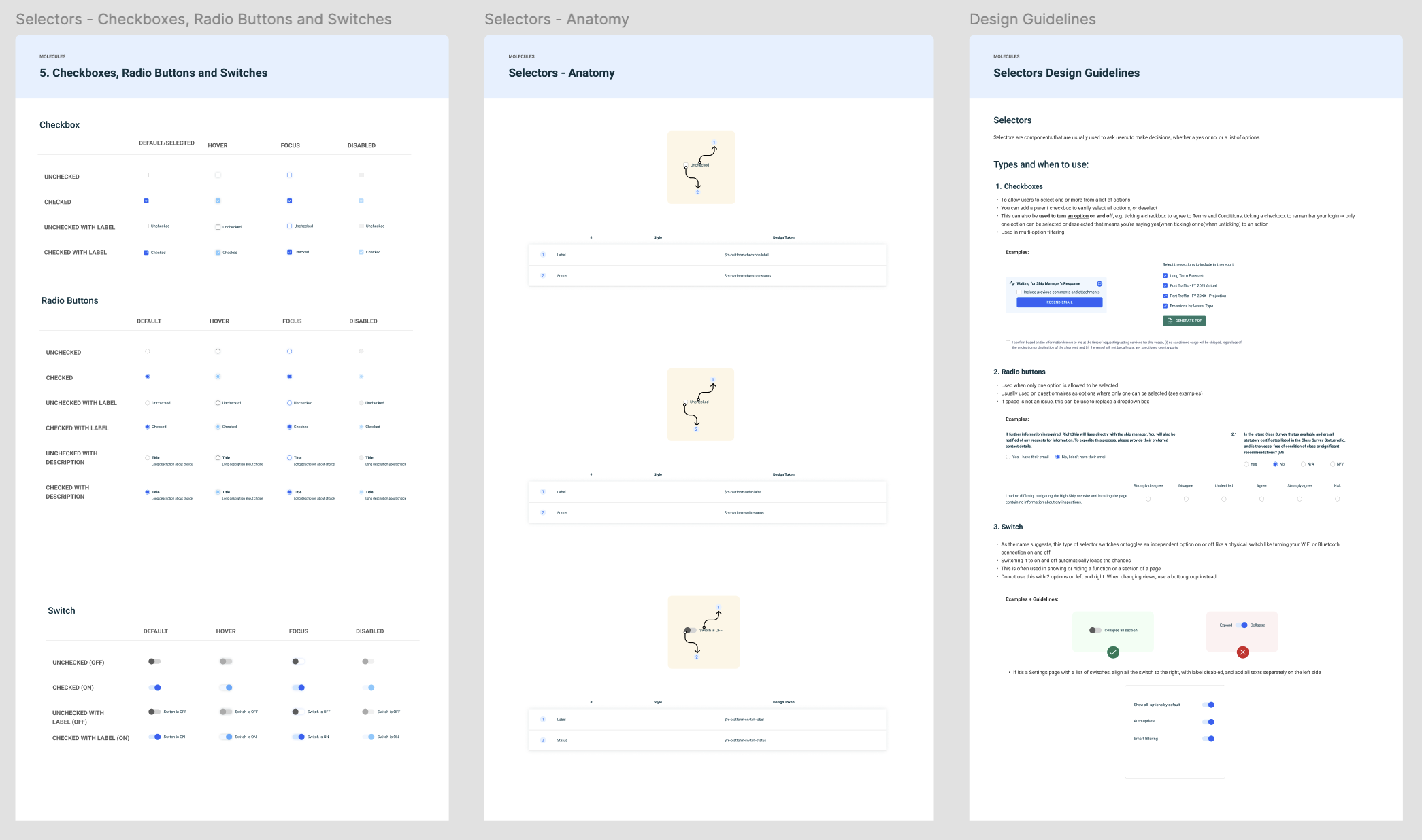
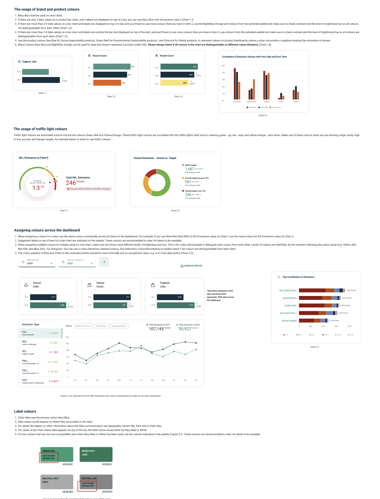
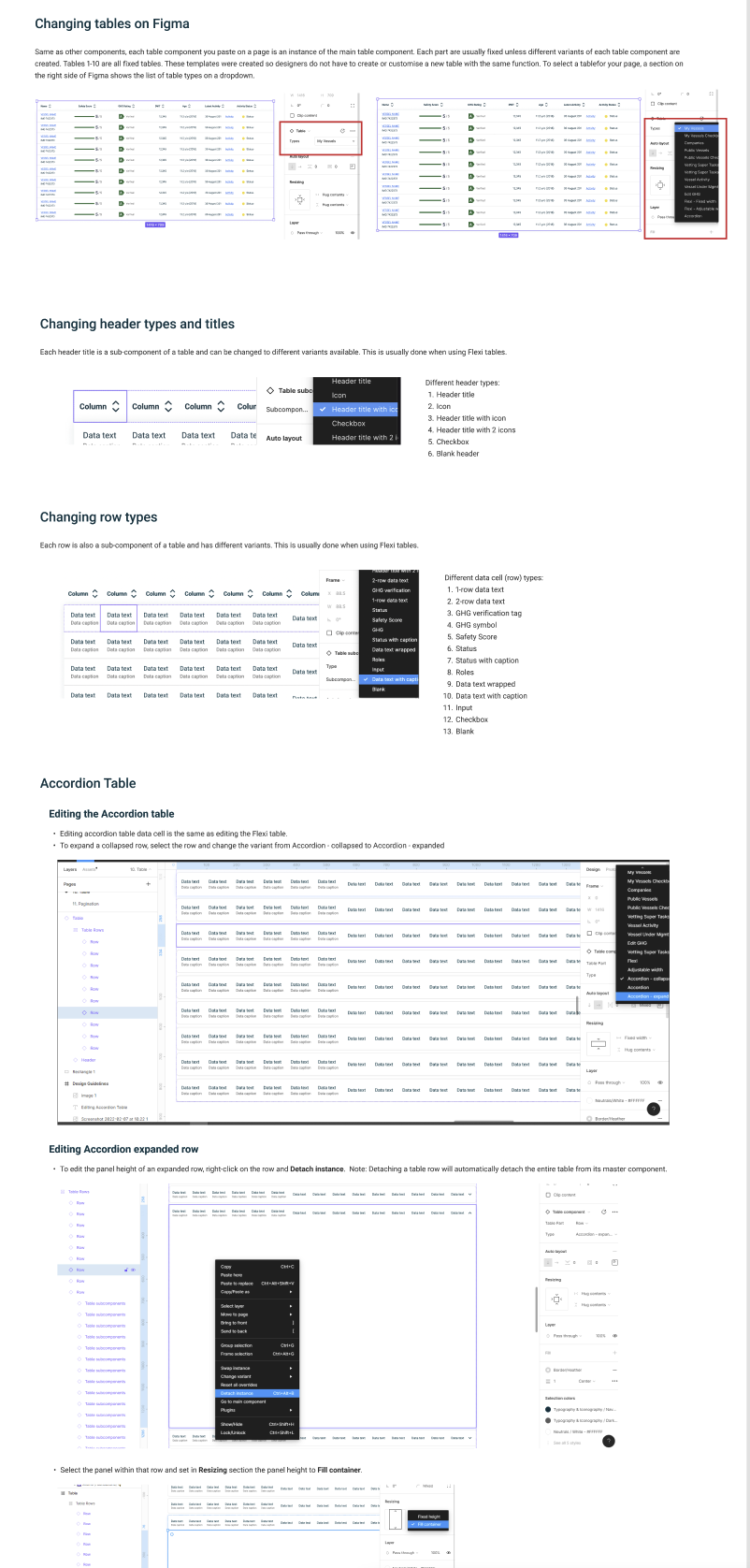
Figure 3 Examples of the component anatomy, chart usage guidelines, do’s & don’ts, and customising one of the most complex component in the design system (Tables).
5. Adoption & Advocacy
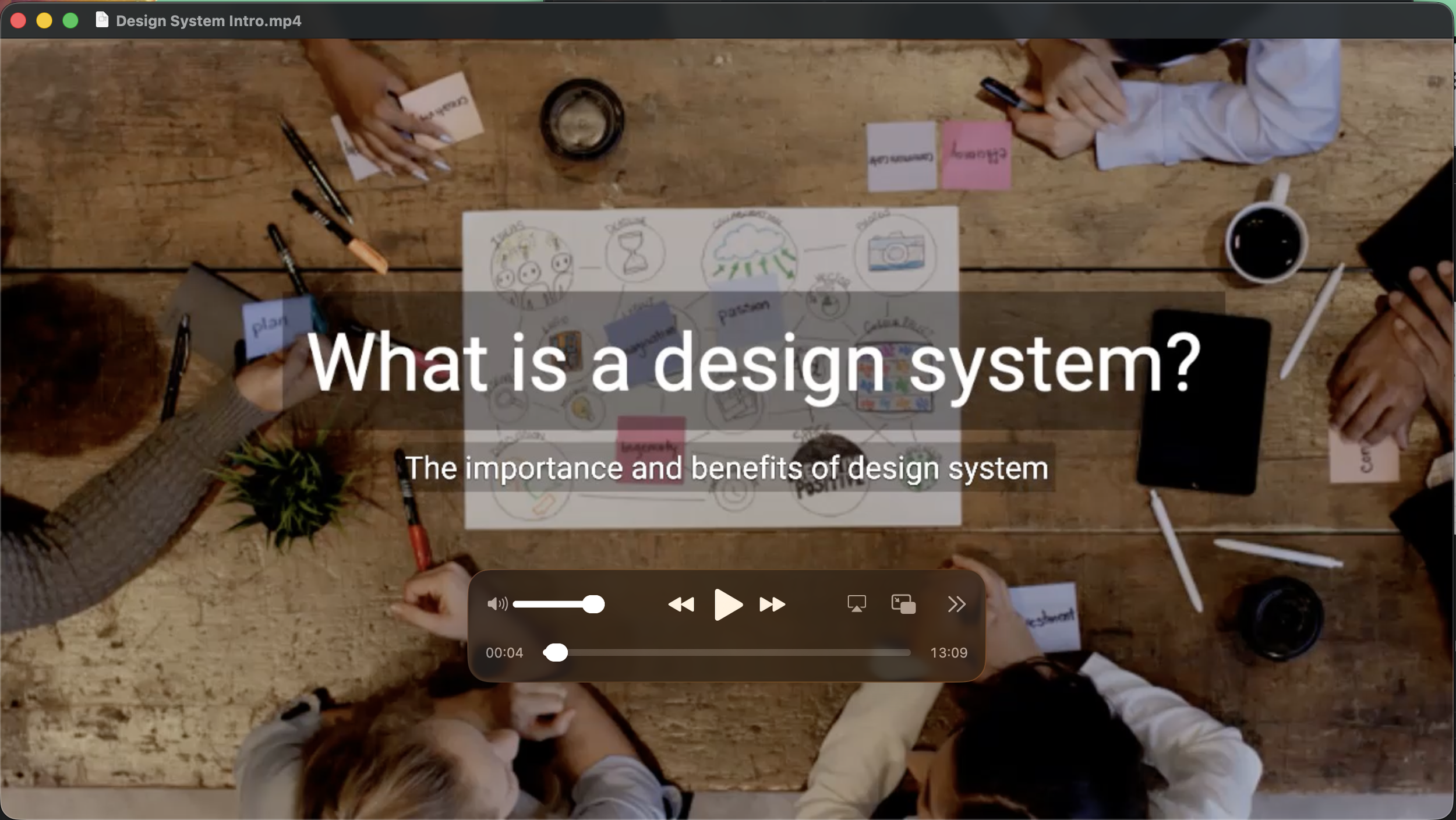
Figure 4 Video explainer created for the company-wide adoption of the design system after it was published
To drive system usage, I facilitated:
Design System Onboarding for the entire Design Team & new members joining
New components creating training sessions
Weekly syncs with developers to align on implementation
Created a request channel for component suggestions or fixes
Conducting workshops for company-wide adoption and roll-out
Creation of knowledge base and change request system
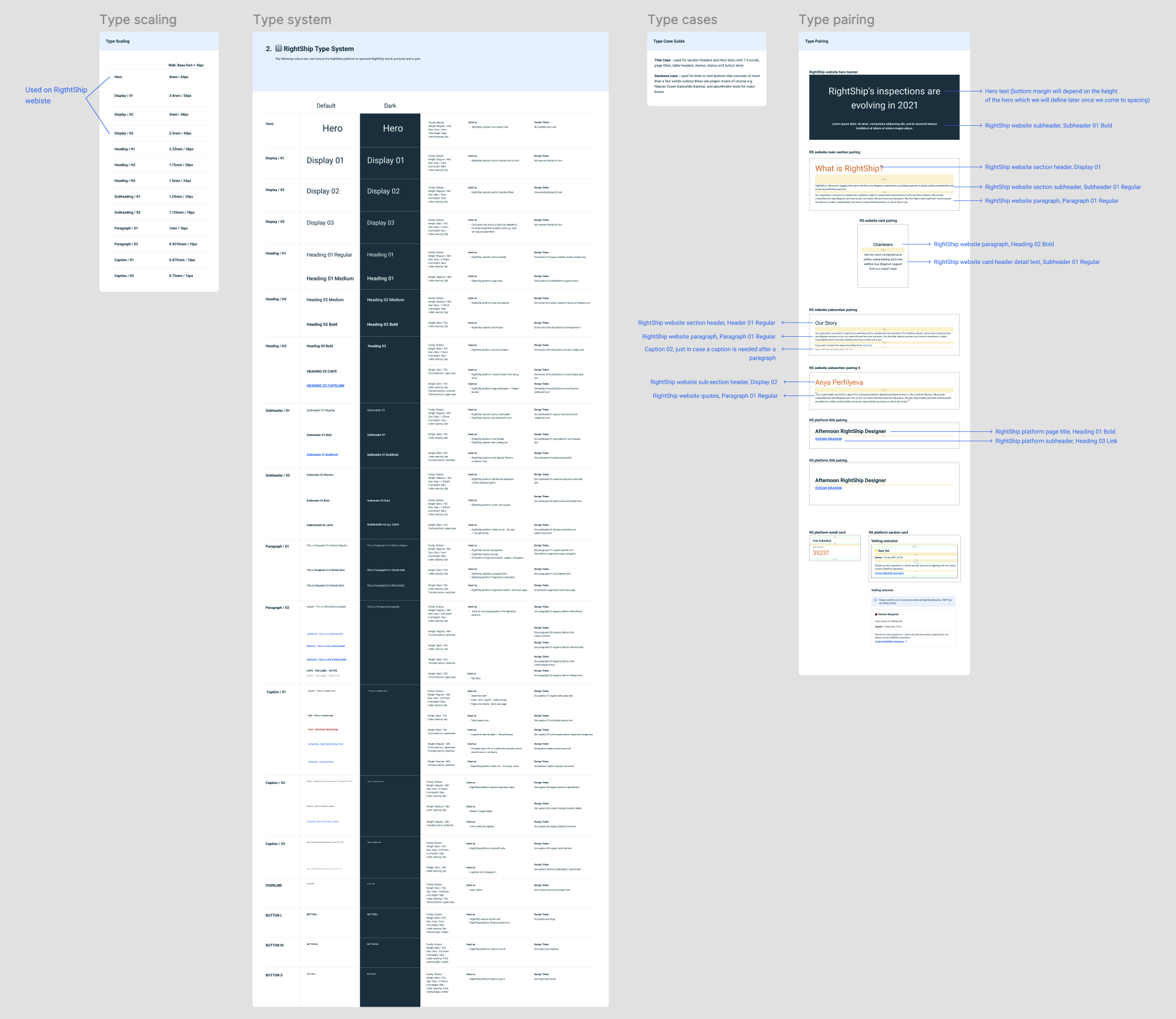
Figure 2 Building the type system and aligning Marketing & Product type systems across the company
Results
| Metric | Impact |
|---|---|
| Components reused | 80%+ of new screens used library components |
| Efficiency gain | 20% increase in design-to-dev speed |
| Design consistency | Significant reduction in UI inconsistencies |
| Cross-team adoption | Used across 4+ product team squads |

Figure 5 Image showing one of the design system components, its variants, the anatomy and the usage guidelines
Key Learnings
Design systems are products — they require onboarding, communication, and iteration.
Figma’s auto-layout and variants were key to scaling effectively.
Component governance is a balancing act between flexibility and standardization.
Adoption grows faster when documentation is paired with human support.