Restaurant Booking Application
Designing the main booking page of a new mobile restaurant booking application
The challenge
Design the main booking page of a new restaurant booking app based on the existing competitor apps available in the market.
Discovery
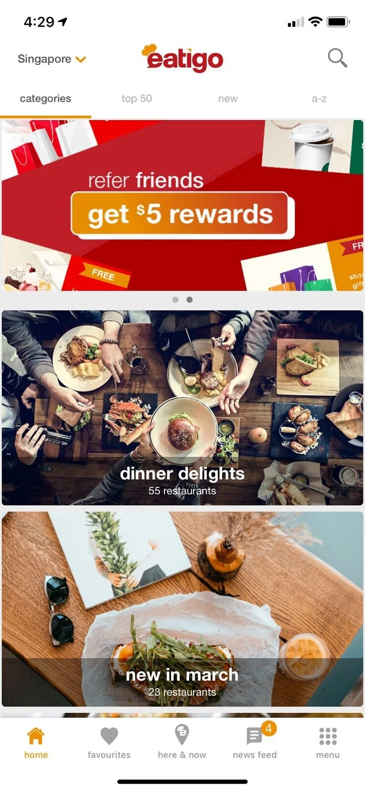
Contextual inquiry and competitive analysis
Since I am a part of an expat dragon boat community in Singapore, which is quite a big one in Singapore, I shared this idea and brought up the question of what are the restaurant booking apps that they use. I have also asked friends through group chats outside the community. I managed to shortlist 6 restaurant booking applications to do a competitive analysis on. The following are the 6 applications:
Competitive analysis results
User survey
I have sent out a survey form to the groups whom I’ve asked for which booking apps they use. I chose these groups of people as they are very diverse when it comes demographics. Below is the survey form and the responses.
Survey and interview findings
Mostly discovered the app through either social media or just by Google-ing.
They use the app when they are in a new places or travelling.
They want to see what’s on the menu before deciding to book.
They usually book the place that are close to famous landmarks and with a view.
Define
Creating a user persona
Based on research, competitive analysis and interview findings, I created a persona that best represents most of the participants, the expats. Expats are a good target group as they like to explore different options, and are usually the users of such app. Based on a lot of Singapore expat articles, a restaurant booking app is one of the most useful app, and a must when living when living abroad.
Booking a restaurant (The user flow)
Morten, looking for an authentic experience and a convenient restaurant to visit with reliable reviews/recommendations.
Using Gourmet+ app, Morten searches for nearby restaurants with reliable recommendation and a good seating view. He finds a suitable one and books it.
Ideation
Design rules
I based my ideation process on some design rules and all the findings from the survey, competitive analysis and interview.
Discoverability and learnability - with the use of back buttons, they can go back to their previous action
Less is more - form rules, only ask what’s required. We don’t want to get frustrated filling out a long form. Also, for the name, you don’t have to ask for the first name and last name separately. It gets quite complicated if you have a Chinese name.
Error prevention - instead of using text input field, a select field is used. This is to make sure the user gets the date, time and number of persons right. And also, for the country code. This one will automatically detect location.
Form fields are in single-column layout - when user scans the form in Z pattern, it slows down the comprehension, especially on mobile devices. Labels are also top-aligned so users can scan the form faster.
Order form fields logically - this can be compared when making reservations through phone calls. Customer care usually asks first for the date of reservation, the time and the number of people to check availability. And once confirmed, then they will ask for your details.
Distinguish field requirement - Some fields are required and you have to let users know about it. But marking fields, whether required or optional, lightens user’s cognitive load. “If the word optional is next to the field descriptor, that task becomes a tad easier" (according to Nielsen Norman Group on the topic of Usability).
Deliver
Prototype and test
Test the idea to validate all the assumptions. Assess the results, iterate quickly, and test again. Below is a video of the prototype showing the restaurant booking flow.


